Sanderson Brown Ltd.
Brand refresh and identity pack for an Architectural Technology firm with heart.
Client: Sanderson Brown Ltd.
Involvement: Logo design, brand identity.
Sanderson Brown Ltd liked their existing logo but hoped for it to be refreshed, professionalised, and expanded in to a full brand toolkit for use across various channels. Striking the balance between contemporary style and relating to their traditional client base was important to the team.
Taking inspiration from local building materials, the local environment, and the team’s area of expertise, I developed a brand toolkit including logo, colour pack, tone of voice, boilerplate copy, templates, and photography guidance.
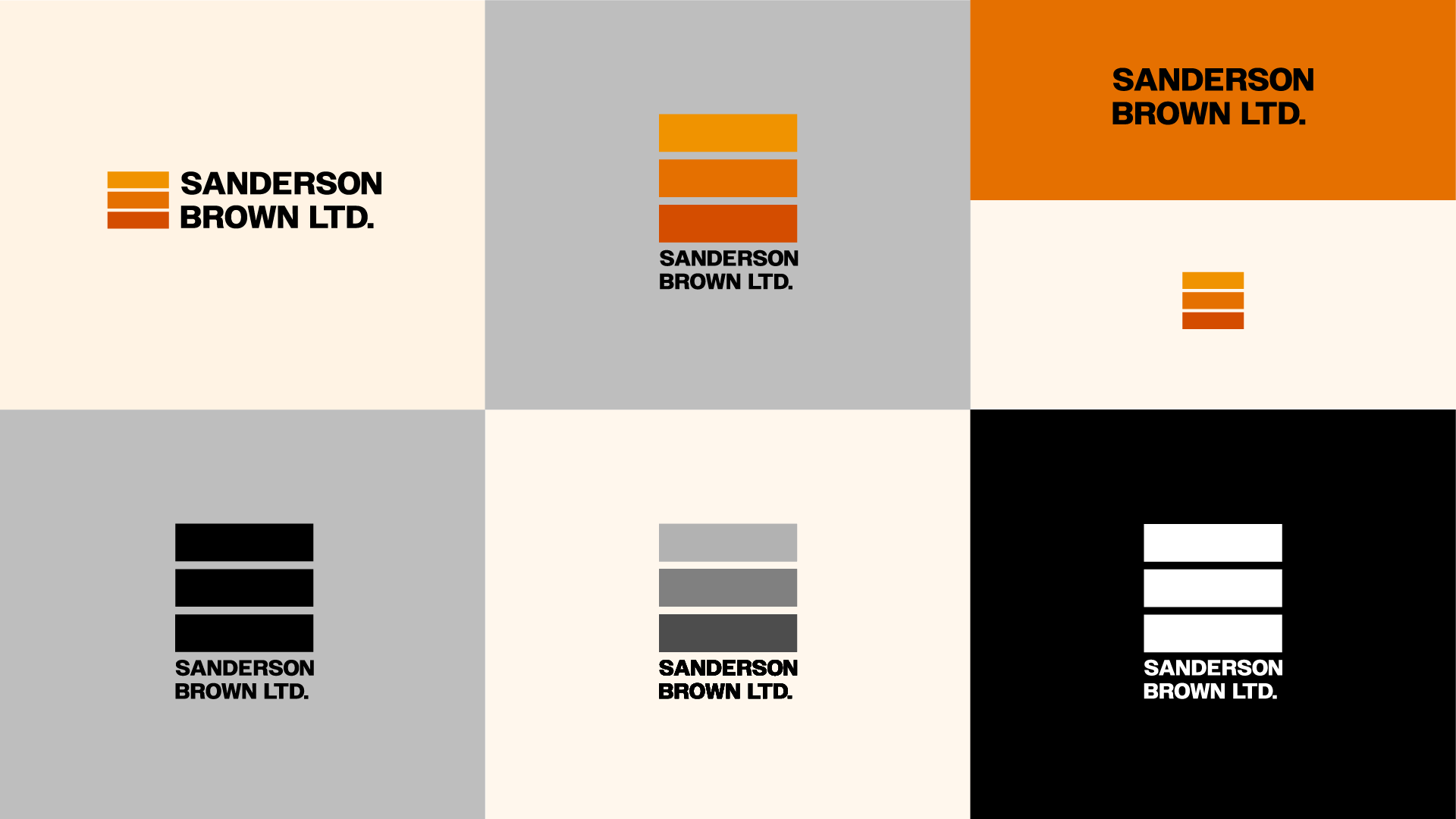
The central orange colour is an energetic dash of colour inspired by the rich brick used in many rural Yorkshire homes. Balanced with a traditional grey for an air of reliability and authority and softened with a pale pink stone colour, the trio form a flexible and future-proof colour scheme that stands out from competitors.
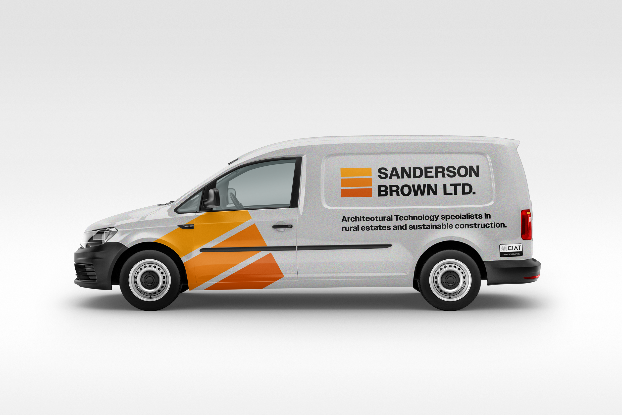
The logo element is used as a graphic motif at large scale, rotated, and bleeding off objects or pages. The clean and slightly softened Owners Bold typeface serves well across the logo, headlines, and body.
![SBltd_Brand Guidelines_V7 [Recovered]_beige card.jpg](https://images.squarespace-cdn.com/content/v1/5f427baa0086db7a1e890c65/24b7b294-880e-4852-ab9f-e4786547e153/SBltd_Brand+Guidelines_V7+%5BRecovered%5D_beige+card.jpg)
![SBltd_Brand Guidelines_V7 [Recovered]_event poster.jpg](https://images.squarespace-cdn.com/content/v1/5f427baa0086db7a1e890c65/c387d59b-c26a-4bbe-a980-18baa66faad0/SBltd_Brand+Guidelines_V7+%5BRecovered%5D_event+poster.jpg)

Logo element are wrap-around graphic element

![SBltd_Brand Guidelines_V7 [Recovered]_case study 1.jpg](https://images.squarespace-cdn.com/content/v1/5f427baa0086db7a1e890c65/3e1ad0a4-16b1-409f-8a9e-2aaaaf3b20fe/SBltd_Brand+Guidelines_V7+%5BRecovered%5D_case+study+1.jpg)

Adding colour and balance to the logo
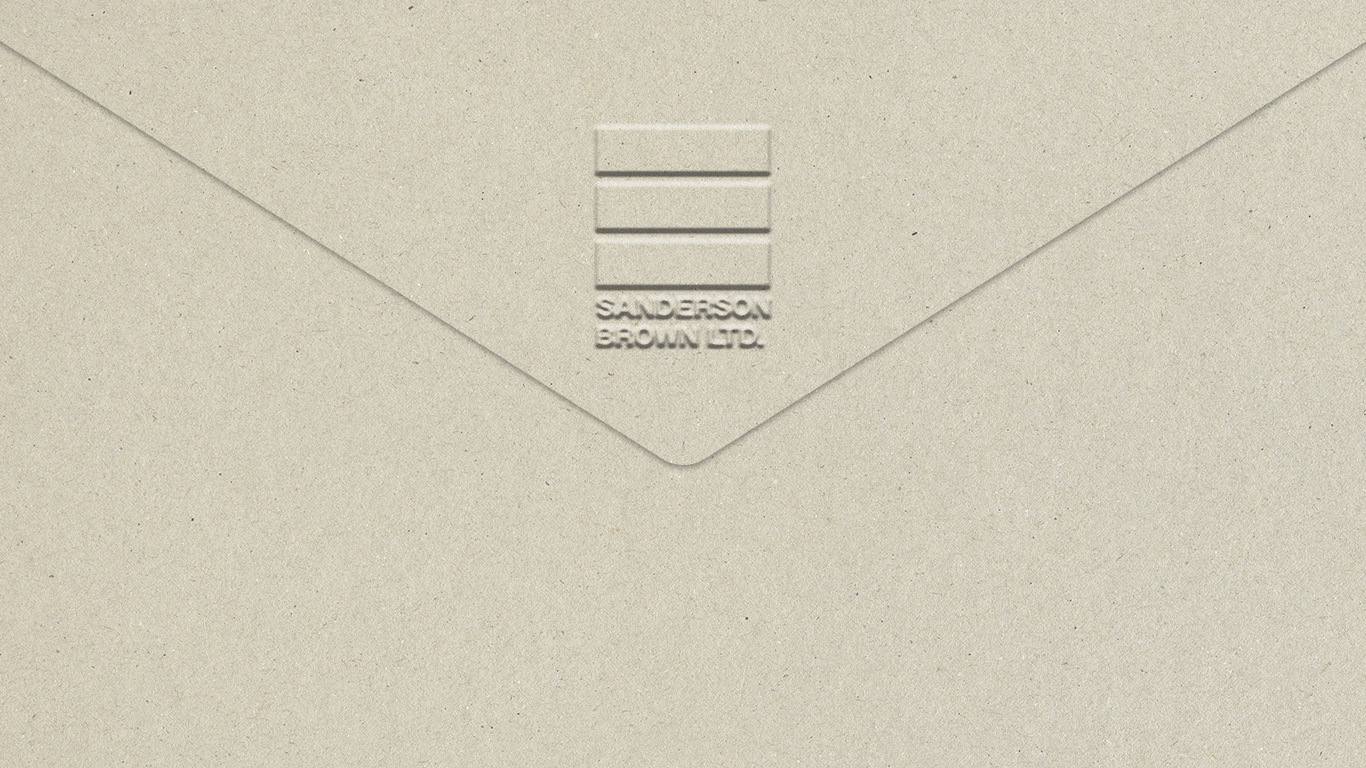
Natural, textured materials in stationary
![SBltd_Brand Guidelines_V7 [Recovered]_orange card.jpg](https://images.squarespace-cdn.com/content/v1/5f427baa0086db7a1e890c65/524dff23-61ea-48ff-8030-7c73fa36a944/SBltd_Brand+Guidelines_V7+%5BRecovered%5D_orange+card.jpg)
![SBltd_Brand Guidelines_V7 [Recovered]_black card.jpg](https://images.squarespace-cdn.com/content/v1/5f427baa0086db7a1e890c65/35c933e5-6804-4c6d-9f39-d7c7d4da7a8f/SBltd_Brand+Guidelines_V7+%5BRecovered%5D_black+card.jpg)

![SBltd_Brand Guidelines_V7 [Recovered]_grey card.jpg](https://images.squarespace-cdn.com/content/v1/5f427baa0086db7a1e890c65/2d2b59d8-dc3d-4631-9fa4-43a317fe4f24/SBltd_Brand+Guidelines_V7+%5BRecovered%5D_grey+card.jpg)

![SBltd_Brand Guidelines_V7 [Recovered]_case study 2.jpg](https://images.squarespace-cdn.com/content/v1/5f427baa0086db7a1e890c65/a33e67e4-a818-4543-ad02-a05f99f5b596/SBltd_Brand+Guidelines_V7+%5BRecovered%5D_case+study+2.jpg)
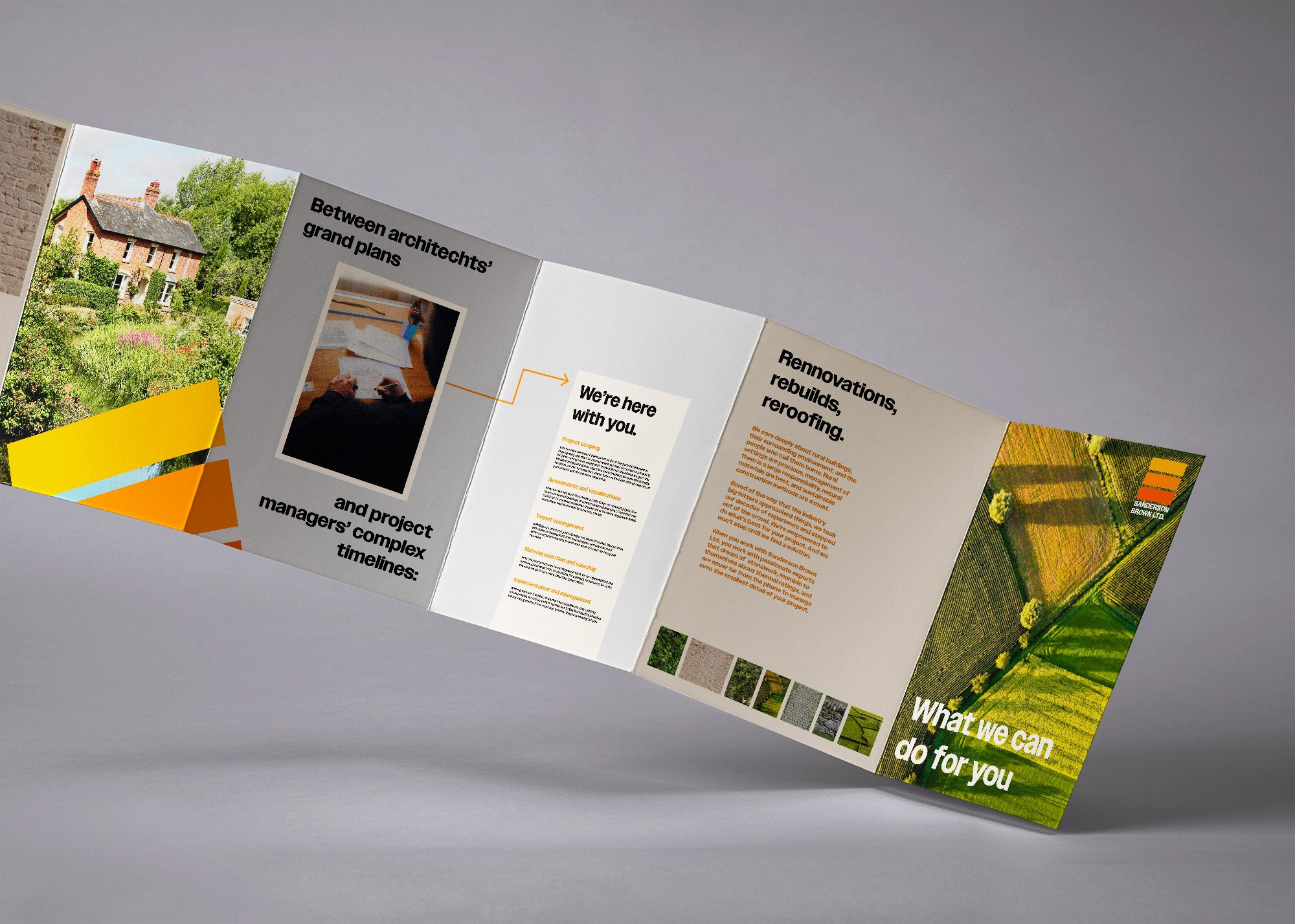

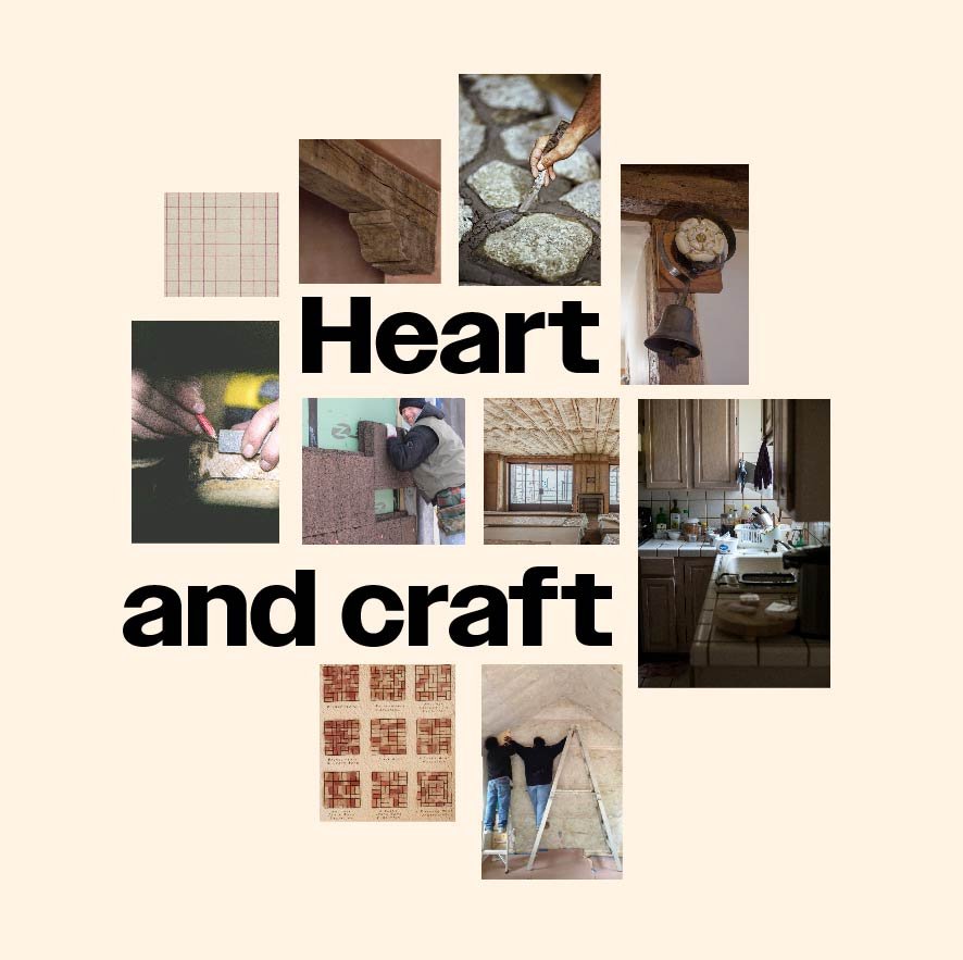
Visualising what's important to the client

